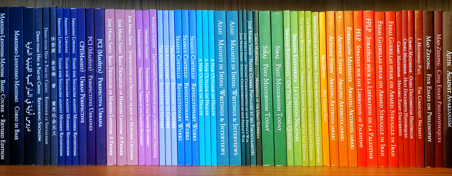
This edition closely follows the recommendations of the American Printing House for the Blind; it isn’t just a « big version » of the book, but an edition carefully optimized for visually impaired comrades.
For this edition, we have increased the size of the characters from 12pt to 18pt, changed the font to sans-serif, increased the spacing between words and lines, and removed distracting formatting such as hyphenations or paragraph justifications as much as possible. We also increased the size of the book to A5 (the same size as our New Roads/Foundations books) and we used ivory paper to minimize the glare.


